Nutrivel is a company that was born as a marketer and distributor of specialized medicines for patients with diseases that require special type of food and nutrition. Her creator, a young entrepreneur and nutritionist, contacted me to create her brand, image and marketing strategy. This is the result of several days of analysis, research and creative process.
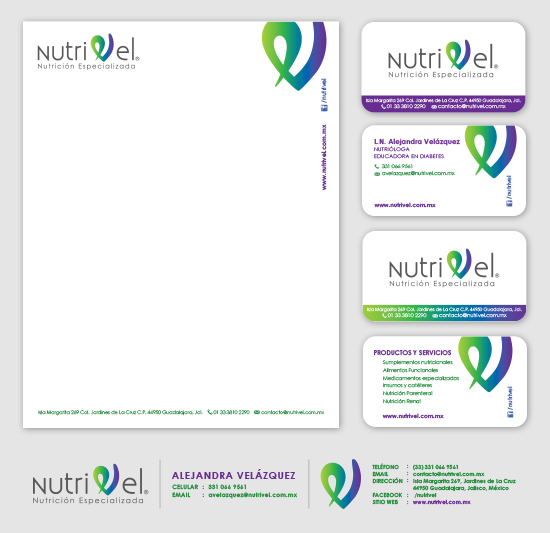
The applications in stationery of Nutrivel play with the symbol of the letter “V” that is the isotype of the mark, the functional graphic element of the identity. Its shape is based on a heart. The heart because it is one of the main organs of the human body that carries blood and nutrients throughout the body. The green and purple gradient colors symbolize the life and chemistry of medicines.
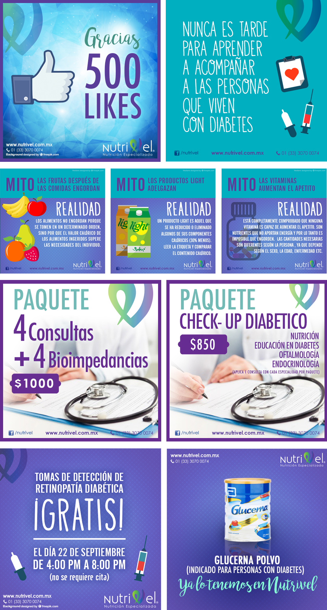
Design of images for facebook.