

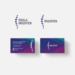
Irigoyen
The spinal column as a symbol of support, for the identity of this business that takes care of human resources of the...
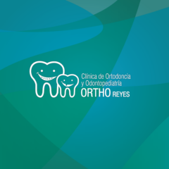
Ortho Reyes Medical Clinic
For Orthodontics and Pediatric Orthopedics clinic Reyes we designed a logo that reflects the two specialties it offers its patients, without emphasizing one or the other. The symbolic part of the logo consists of two smiling characters, they are two molars. One is bigger than the other and has a smile with brackets, another is small and without a tooth. They represent Orthodontics (an adult with brackets) and Pediatric Dentistry (a child whose tooth has fallen) and its purpose is to make patients aware of what each specialty does. The colors blue and green are colors that give us all calmness, peace and tranquility. They represent life and well-being, health and balance. They are colors that give confidence, security and cleanliness in the company that carries...
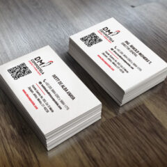
DM Compostela Design and Furniture
DM Compostela is a company that designs and produces quality furniture at an affordable price, distributing them through a network of selected wholesalers in the city of Guadalajara,...
PROAIR Outdoor cinema
Outdoor cinema is a unique experience that transforms public space, and invites you to have a meeting with the night. The owners of PROAIR, experts in outdoor projections, were in need of updating their old image, a new image that still reflects their main characteristics with which their clients recognize them: they are pioneers in the outdoor cinema exhibition in Mexico And Latin America, part of the AIRSCREEN® family, who have the best equipment and the best service, quality film festival, and 10 years experience. The result was part of a process of feedback from them as they sought not to lose their essence and to continue being recognized by their customers, so they decided to leave the symbol of Aztec speech that was in the original logo as a symbol of constant communication, and the rectangular silhouette of their inflatable screens that characterize them. Here the...
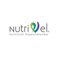
Nutrivel
Nutrivel is a company that was born as a marketer and distributor of specialized medicines for patients with diseases that require special type of food and nutrition. Her creator, a young entrepreneur and nutritionist, contacted me to create her brand, image and marketing strategy. This is the result of several days of analysis, research and creative process. The applications in stationery of Nutrivel play with the symbol of the letter “V” that is the isotype of the mark, the functional graphic element of the identity. Its shape is based on a heart. The heart because it is one of the main organs of the human body that carries blood and nutrients throughout the body. The green and purple gradient colors symbolize the life and chemistry of medicines. Design of images for...
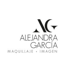
Alejandra García
Identity of Alejandra García, professional makeup artist and young entrepreneur in the city of Guadalajara. A monogram with the initials AG was designed for its application in different products. Simple and light, authentic as her work reflects...
Portfolio
![]()
![]()
![]()
![]()
![]()
![]()
![]()
Recent Projects
-
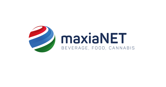
 maxiaNET Aug 4, 2018
 -

-

-

-

-

-
